
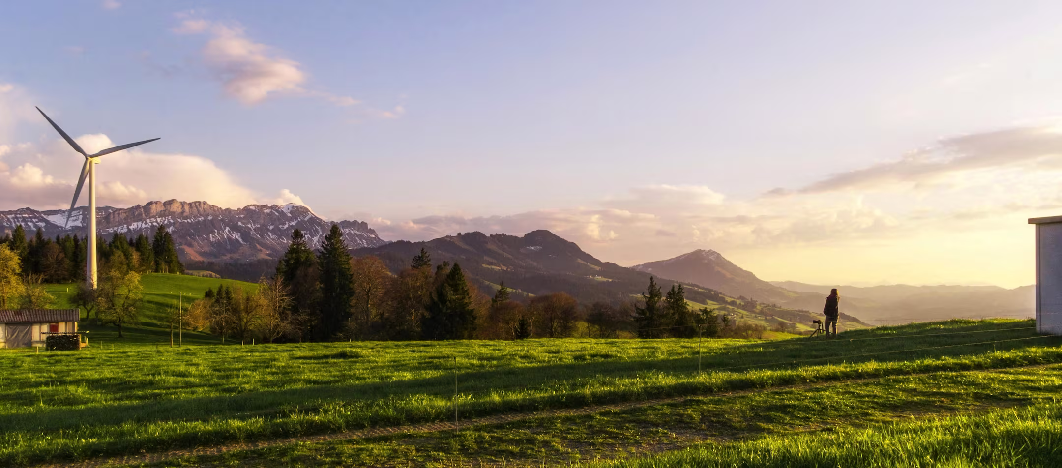
This case study demonstrates how climate risk storytelling can be presented through a calm, structured consulting layout. It focuses on translating complex exposure, vulnerability, and resilience concepts into clear, readable sections. The narrative highlights a professional tone designed to feel credible without becoming overly technical. As a sample, it shows how a sustainability website can communicate depth with clarity.
The core challenge in this scenario was presenting climate risk information without overwhelming the reader. Risk terminology, uncertainty, and multi-location context can quickly feel dense and difficult to follow. The content needed to remain trustworthy while still being accessible for non-technical audiences. A clear structure was essential to keep the message focused and understandable.
The solution showcased a structured flow that guides visitors from context to insight and next steps. Information is broken into digestible parts, using hierarchy and pacing to reduce cognitive load. Each section supports the next, reinforcing the narrative rather than repeating details. The layout demonstrates how clarity can strengthen confidence in complex topics.
This case study reinforces that clarity is created through structure, not excessive detail. A calm tone and consistent pacing can make technical subjects feel approachable and engaging. The example also shows how design hierarchy can support comprehension before persuasion. Ultimately, it highlights how better communication can lead to better decision-making.

"Their climate modeling and risk analysis elevated our decision-making to a whole new level. A reliable partner for any sustainability-driven organization."

For Future was built on the belief that thoughtful action leads to lasting positive impact. Through honest insight, grounded expertise, and purposeful strategy, we guide your journey with clarity, resilience, and a commitment to meaningful progress.